Introduction to Members First
Members First Credit Union started from humble beginnings. Formed in 1954, the member-owned, nonprofit organization began in a small space donated by Escambia County Schools. In fact, their initial membership was open exclusively to the education workforce. To no surprise, their first official name was Escambia County Teachers Credit Union.
The company built its brand identity around providing competitive rates along with other services to meet member needs. Their strong focus on customer service set them apart from the competition. This way of thinking resulted in a company growth over the next decades that prompted the organization to extend their services into new locations.
After several decades of continued success and membership growth, the company decided to incorporate their service approach into their company name. The name Members First was born.
Company Values at Core of Rebrand
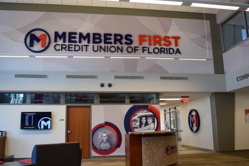
Members First has always been true to their philosophy of putting member service above all else. They acknowledge the importance of community, partnership, and family within the membership. After all, those values have shaped the history and growth of the brand from the very beginning.
The organization wanted a way to display these longtime company values to new and old members alike. In order to emphasize their commitment to customer service, Members First decided on a complete rebrand of their corporate image that would entail a modern refresh on their logo.
In addition to this, Sky Design was brought in to update their flagship location. This refresh included new colors and finishes, environmental graphics, wayfinding and dimensional letters to express their commitment to customer service. The credit union wanted to immerse their members in a branded environment to encourage further member growth.
Brand Identity and Environmental Graphics
For years before the rebrand, signgeek has partnered with Members First on many branding projects. Not only that, but we have had numerous successful collaborations with their design team, Sky Design. Sky design is a well-versed graphics design company hailing from Atlanta. Their team would handle the signage and graphic designs, while signgeek would bring the brand to life through fabrication of all the signage, environmental graphics and installation.
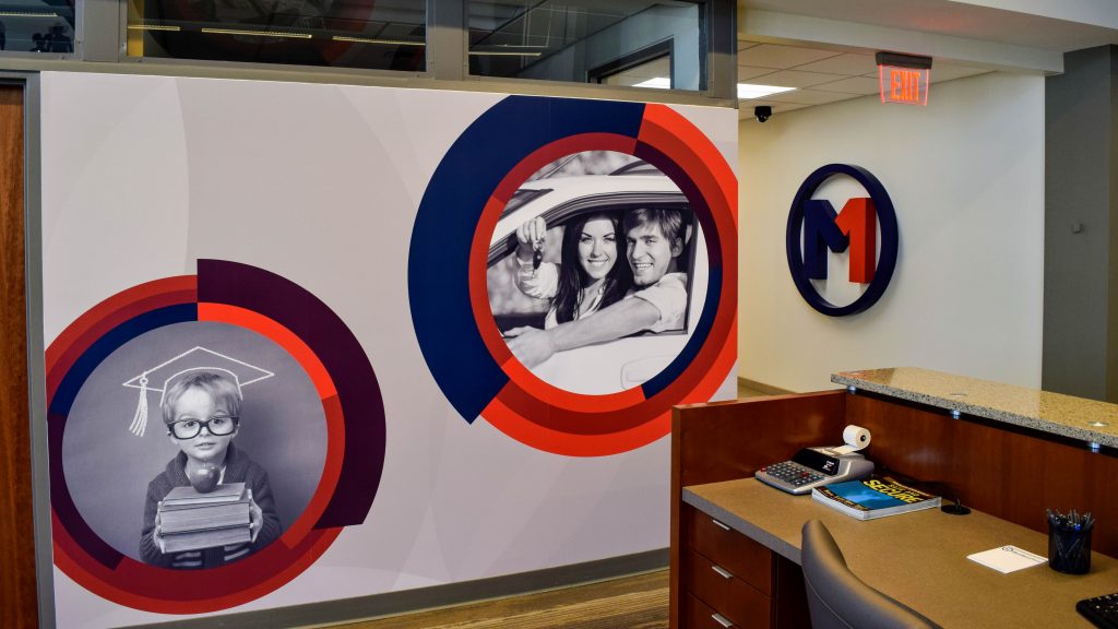
The best way to fully immerse your audience in branded environments is by walking them through an experience that showcases company culture. What better way to do this than through experiential graphics? Members First wanted a branded space that communicated family, partnership, and community. All groups involved agreed it was clear to go the experiential graphic route.
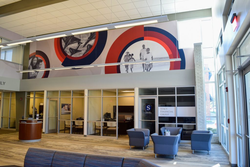
Furthermore, they also aimed to create a lobby space that would be more welcoming and comfortable to all. Part of this meant making the switch to a more modern look. The teams chose to put away the traditional teller windows, and transition to an open layout – with kiosks, high ceilings, and comfortable seating options.
Communicating Values Through a Branded Environment
We chose a variety of ways to portray the brand identity of Members First. Brand-specific signage, dimensional letters and environmental graphics were all products of choice in achieving this goal. The purpose of this signage was to not only help navigate members around the building, but in doing so, show the qualities of the Members First philosophy of incredible customer service.
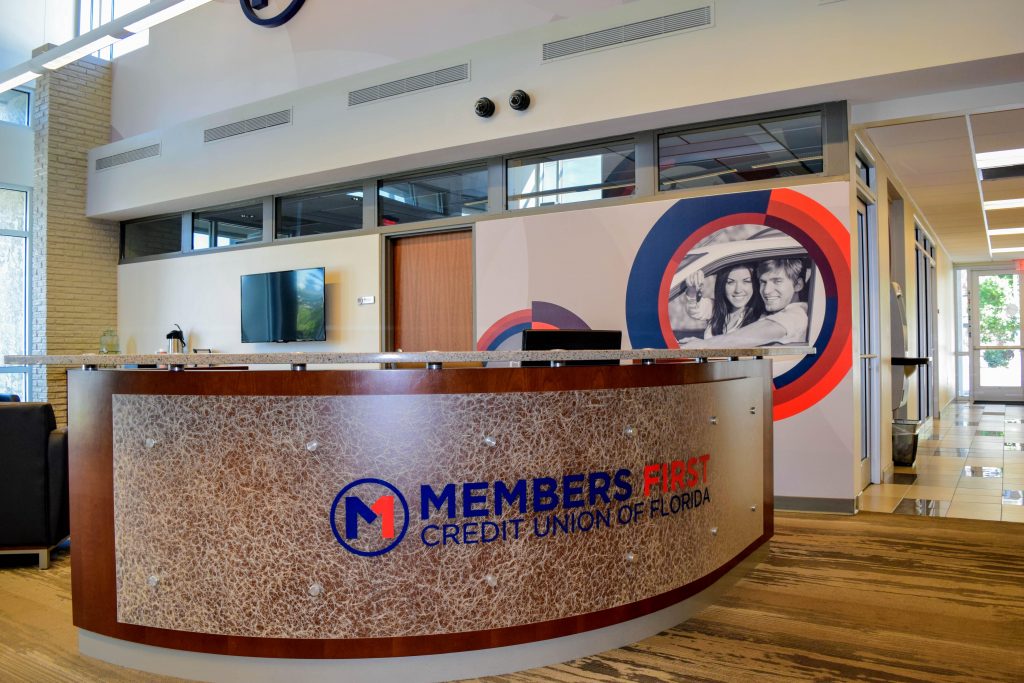
Dimensional Letters, Logos and Wall Wraps
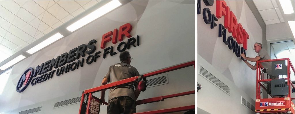
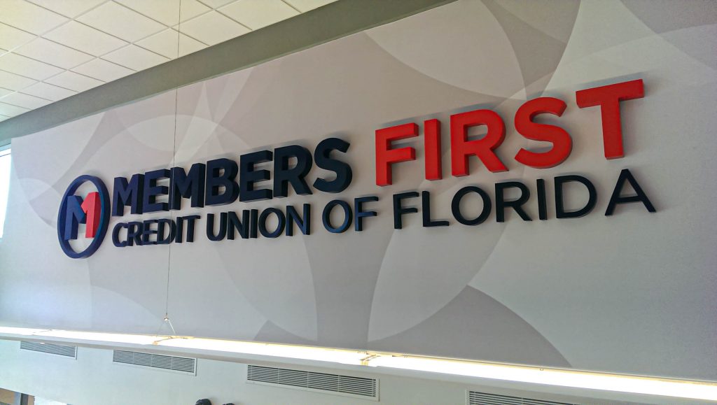
Our team filled the upper wall on one side of the lobby with dimensional channel letters, accompanied by a new Members First brand logo. Beneath these letters lays a patterned vinyl wall wrap. This letter and wall wrap combination presents a warm welcome to members as they enter the spacious lobby and is the epitome of the environmental graphics.

The next set of dimensional letters in the lobby were comprised of a brushed aluminum composite material, for a bright, refined look. We placed these letters on the wall above a few of the new teller kiosks. They spell out key company value words, such as “Community”, “Partnership” and “Family”. As members meet with the associates at the kiosks, they are simultaneously met with these brand beliefs, too.
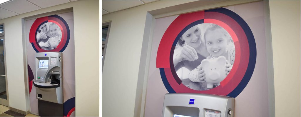
No wall went untouched with this Members First rebrand. The wall graphics installed over the ATM are a great example. The reasoning for placing printed graphics in such an unconventional spot is the added interest it sparks when using the machine. Creating interest and making small moments memorable is all part of enhancing member experience with brand identity imagery.
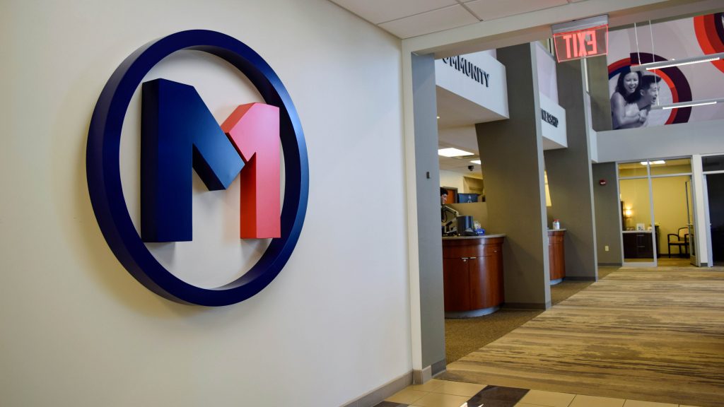
We mounted a second dimensional Members First logo in the same hallway as the ATM machine. This logo really brings the branded environment together, as it is easily seen from multiple vantage points of the lobby.
Brand-inspired Accessibility
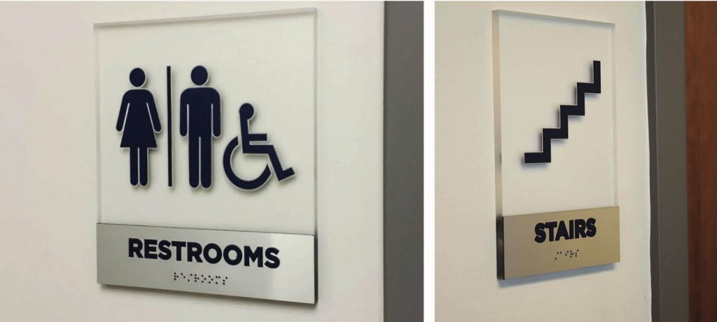
The credit union wanted to feature room identity signs that were friendly to all and reflected the new company rebrand. The signgeek team crafted custom ADA compliant signage that provide wayfinding and accessibility to visiting members.
Wayfinding Leads the Way
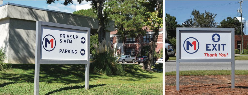
To be successful in moving guests from place to place outside of the building, branded wayfinding leads the way. Our technicians built directional signs based on current ADA standards – to direct the members in a safe and compliant way.
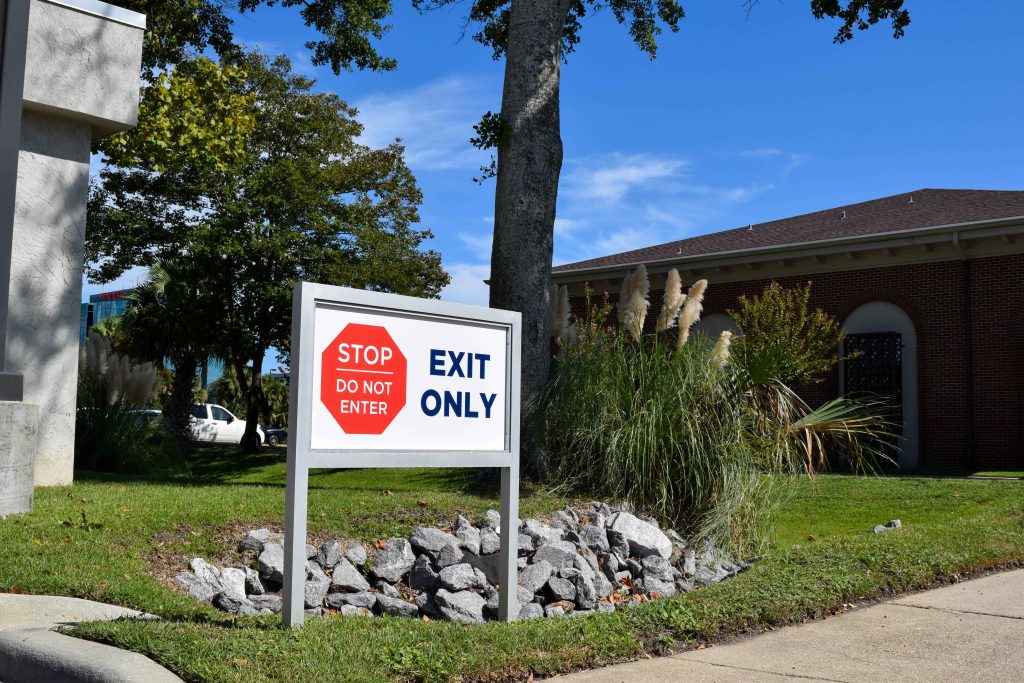
Continuity of Rebrand and User Experience
Our principal goal in this project was to help Members First affirm their core values and philosophy to their members through experiential graphics. We also wanted to exhibit their rebranding campaign through the fabrication of brand identity signage and environmental graphics.
We helped our client reach their goals by creating an immersive, branded environment through experiential graphics. Wall wraps, dimensional letters, and wayfinding signage all brought the key principles of the credit union to life. It was a pleasure and honor to partner with a humble and successful organization such as Members First. We are glad we could play a small role in the bright future of this brand.