Wayfinding systems help you guide your guests throughout the exterior and interior areas of your brand space. Furthermore, these sign systems can help ease frustration in stressful environments such as hospitals or medical offices. Wayfinding helps your guests and visitors get where they’d like to go! There are a lot of factors to keep in mind when choosing a wayfinding system for your company – but that does not mean it has to be a difficult choice. 6 key options to consider when selecting a wayfinding system are your overall scope, goals, ADA requirements, branding, future needs and perhaps even using environmental graphics in place of traditional signage.
Identify Your Most Important Goals For Your Wayfinding Project
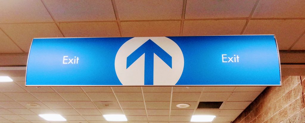
How are you going to get the people from one point to another?
Defining your strategies for your wayfinding system will help you get a more narrow focus on what specific sign products to incorporate into your plan. How are you looking to connect your visitors to the brand space? Is your signage intended only to navigate or to help with traffic flow, as well? Have you considered the importance of ADA aspects for your signage? The answers to these questions can vary based on environment and organizational needs.
A large, expansive hospital campus will have different sign needs than a small dentistry with only a few hallways. A hospital campus would include a full exterior parking sign system to ensure guests can easily find appropriate parking spots, as well as effortlessly make it into the buildings to get to their appointment on time. Meanwhile, a dentistry may have a few designated parking signs and some directional help, but nothing major like a parking garage or satellite lot entails. Furthermore, a local church’s sign plans would differ greatly versus a regional airport. You get the idea of how different business sizes, types and locations will impact individual wayfinding system needs.
Determine The Scope of Your Project

One of the first things to decide on before getting into the details of a wayfinding system is the overall scope of the project. How big will the job be? Several key factors of your signage project to consider are: timing, materials, budget, design, branding considerations and manufacturing.
- Timing: How soon will you need this wayfinding system to be completed?
- Materials: What materials are going to be used within this sign package?
- Budget: What are your allowable costs for the wayfinding signs?
- Design: Will your company handle design or will you need to bring on pro designers?
- Branding Considerations: How will you incorporate brand messaging into the signage?
- Manufacturing: What manufacturer are you going to entrust this sign system with? Do they have the mix of these other tools at their disposal as well?
There are a variety of sign options to choose from when outfitting a building or campus. When you do discuss your wayfinding system with your manufacturer, it’s important to cover both the interior and exterior aspects of the project.
Interior Signage for Wayfinding Project

From lobby directories and overhead directional signage, to room and floor numbering, interior signs insure your visitors never feel lost within your brand space. Large facilities such as hospitals, colleges, and corporate offices all reap benefits from interior signs. Whether it’s making your first 8am class, an appointment or a meeting on time, an established navigation system can help ease frustration in stressful environments and get your guests where they need to go effectively. The quality of being able to easily move throughout a building interior will increase the likelihood of your visitors returning.
Exterior Signage for Wayfinding System
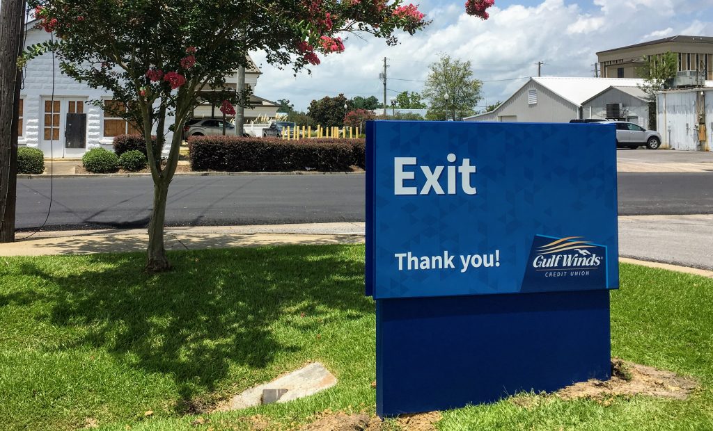
Entryway and directional signs can play a crucial role in creating a welcoming outdoor environment for your guests. Building numbers and names, regulatory and parking signs are all included in an exterior wayfinding package, as well. You will get them to their destination in an easy and stress-free way which will create goodwill and customer satisfaction. Parking signs are important because they get people to the right place in a timely fashion and can also extend the vision of your branding.
Assess Your Future Needs

Will this wayfinding system need to be added on to later on? When entrusting your wayfinding system to your designer or manufacturer be sure to discuss what your future needs might be. It could save you money on what your present needs are as well as your future needs based on the project as whole .
Sign systems can be planned to be implemented all at once, or over the course of a timetable that works for your brand’s goals. Oftentimes, you can save on costs when ordering a full wayfinding package in the beginning of the process. For example, you may need three hallways to be filled with room signs. However, you plan on doing this one corridor at a time. Ordering wayfinding signs for all three areas initially will typically save you budget and time later on down the road.
Understand the ADA Requirements for Wayfinding Systems
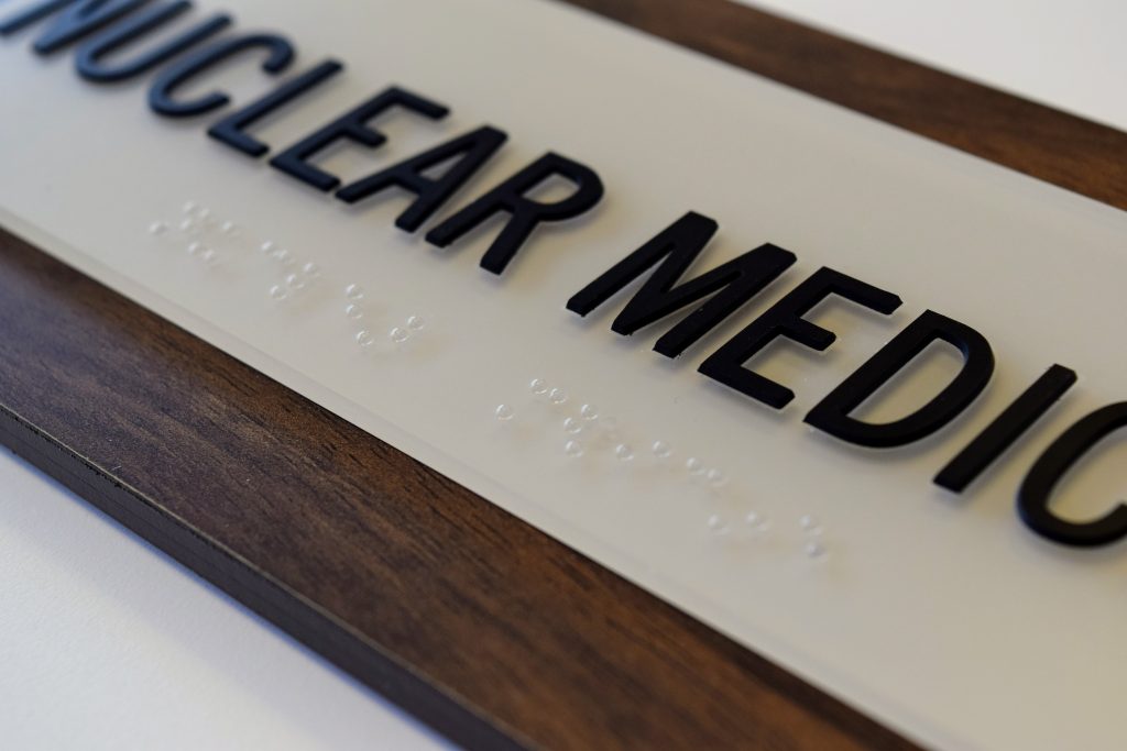
When creating an ADA compliant wayfinding system, there are a number of working parts to consider regarding compliance. For interior wayfinding, braille and raised letters are a few notable distinctions that enable a room sign to follow ADA standards. However, it goes further than that. Sign height, sign size, types of font and contrast of font to backer all have requirements, too.
It’s also important to consider ADA requirements for exterior wayfinding. Yes, typically there may be no braille or raised letters – but ADA encompasses more than those aspects. ADA standards help any and all with disabilities gain access to your brand’s space. This means that ADA doesn’t begin when you enter a building, it starts from the moment a visitor arrives on your organization’s grounds.
How does this correlate with exterior signage? Well, exterior signs need to have a specific size, color, contrast and height. Furthermore, it needs to be easily legible for those who are hard of seeing. ADA legibility standards for signs include font type, size and color. Speaking of legibility, let’s discuss the specifics for interior and exterior ADA signs.
Legibility in Wayfinding

Chapter 7 of the Department of Justice’s 2010 ADA standards give some specific gules on legibility for signs regarding case, style, height, proportions, spacing and thickness. All characters should be uppercase. Font style should be sans serif. Additional, sign font should not be italic, oblique, script, highly decorative or any other unusual form.
As you can see, there is quite a bit to consider when making your sign fonts ADA compliant! Going over all of the additional sections in detail would take quite some time. The point I would like to get across by showing these guidelines is how in depth the details for ADA text are. If you’d like to see the entirety of the signage guidelines, you can find them here.
Having an expert in ADA to help you with what you do and don’t need in this area is very valuable. The knowledge and insight can save you loads of time and money in the manufacturing process. The signgeek team has a thorough knowledge of user-focused design, with understandings of both the Americans with Disabilities Act and the Standards for Accessible Design. We know what’s entailed in creating a space that’s accessible to all including those hard of sight, hearing and physically disabled.
Develop Brand Cohesion with Directional Signage
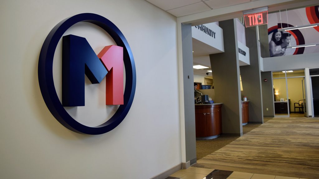
Wayfinding can be a great opportunity to display your brand and improve brand recognition. Connecting visitors to your brand through your space involves using logos, colors, textures necessary to put forth your brand identity. How does this look across a wayfinding system? One would say sticking to brand colors, liberally including your logo and being true to your brand vision on all your signs. However, I’ll go one step further and say putting your brand into your wayfinding doesn’t just stop at inserting logos. Wayfinding is a great opportunity to display your brand’s personality and message in a variety of ways.
Do you have a children’s section in your ICU? Perhaps you would opt for a more interesting texture or a more playful signage backer. Whereas at a law firm you would keep things clean and simple across the board.
Use Environmental Graphics in place of Traditional Wayfinding
Guiding your guests with environmental graphics is an aesthetic, cost-effective alternative to a traditional wayfinding system. Wrapping your walls with high-quality graphics can also transform a typical corporate space into an immersive, branded environment. A great example of using environmental graphics to aid in navigation would be arrows on the floor of airports or directional cues infused into the walls of museums. Using environmental graphics can help keep the flow of foot traffic going in a subtle and efficient manner. Dropping in hints of corporate culture such as quotes, history and branding cues is easy to do when guiding with environmental graphics.
The Value of a Well Planned Wayfinding System
Wrapping things up, you can see all the good that a thought out wayfinding package can bring for your company. Helping guests and visitors find their destination with ease will improve customer satisfaction and in turn, improve your brand image. This positive result will lead to return business and boasts a great case for new customers or members. Not only that, but making sure your facilities are up to par with ADA guidelines will improve accessibility for everyone who visits your brand space. Increasing brand awareness by infusing your signage with messaging and personality is yet another plus of a well planned wayfinding system, as well. Also, we can’t forget about the option to use environmental graphics in place of traditional signage in a wayfinding system. It presents a great opportunity to guide your patrons while immersing them with your brand.
If you are looking for a partner that can handle any and all of your wayfinding system needs, the signgeek team may be a good fit for you. Our crew has over 20 years of experience and are well versed in wayfinding system design, manufacturing, and ADA standards.
One Comment on “Six Important Factors Of Wayfinding System Design”
Shalima
September 30, 2020 at 7:29 am
The article is worth reading. It details about the important points that we must be consider when manufacturing the wayfinding signages. All the discussed points must be consider while choosing a wayfinding signage. In this busy world the wayfinding signages have much importance. If we can find the proper place as soon as possible it saves our valuable time. Best wayfinding signage manufacturers can provide you the good and accurate wayfinding signages with lowcost.